Looking at Apple’s Value
If you haven’t heard yet, Apple ($AAPL), which I believe is some sort of fruit company, reported outstanding earnings yesterday. For the last nine years, the shares have gained an average of 1% each week. When looking at this company’s numbers, words really do fail me.
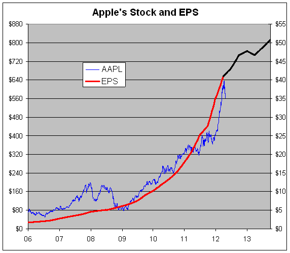
What you can’t do with words you can do with a chart, so below I’ve made a chart of Apple’s stock along with its earnings-per-share. What’s incredible to me is that the stock is still going for a fairly decent price.
The blue line is Apple’s stock and the red line is Apple’s earnings-per-share. The black line is Wall Street’s earnings forecast (I’ll have more on the black line in a moment.) The blue line follows the left scale and the red line follows the right scale.
The two lines are scaled at a ratio of 16 to 1 which means that whenever the lines cross, Apple’s P/E Ratio is exactly 16. I don’t mean to suggest that’s the appropriate multiple for Apple. I used 16 simply because it makes the chart more readable.
About the black line. Apple’s earnings yesterday not only exceeded Wall Street’s forecast but also beat the forecast for the same quarter one year from now. As a result, it appears that Wall Street expects an earnings slowdown. Of course, this isn’t true because analysts will most certainly revise their estimates much, much higher.
For now, I think the best way to view Wall Street’s forecast is to imagine the black line extending from $41 currently to roughly $57 by the end of next fiscal year (September 2013).
With trailing earnings of $41 per share, an earnings multiple of 16 translates to a price of $656. If Apple can earn $57 next fiscal year, then 16 times that comes to $912. I’m not saying Apple will do this, but I believe these are very reasonable assumptions.
Actually, this may understate Apple’s P/E ratio due to the company’s giant pile of cash. The company has an astounding $110 billion in cash. That’s roughly $116 per share. That $116 is probably contributing almost nothing to Apple’s bottom. I mean…have you seen short-term interest rates lately? The only info I have is from the earnings report which lists “other income” of $148 million. Annualized, that’s about 0.5% of Apple’s cash horde.
So to properly look at Apple’s value, we need to apply a multiple to an earnings forecast and then add $116 to that. By the way, Apple will soon start paying a quarterly dividend of $2.65 per share which comes to $10.60 for the year.
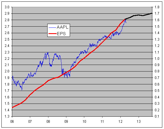
Addendum: Here’s the same chart but with a log scale. I apologize but I don’t know how to make a readable log chart excel chart, so you’ll have to do with seeing the log value on the y-axis. It gets the point across since you can see the earnings line climbing at a consistent rate.
Notice how slightly the recession impacted Apple. You can also see how conservative the earnings estimates are compared with Apple’s earnings trend.
(Instead of a ratio of 16 to 1, this chart has a log spread of 1.2 which comes to a ratio of 15.85 to 1, so it’s nearly the exact same.)
Posted by Eddy Elfenbein on April 25th, 2012 at 10:42 am
The information in this blog post represents my own opinions and does not contain a recommendation for any particular security or investment. I or my affiliates may hold positions or other interests in securities mentioned in the Blog, please see my Disclaimer page for my full disclaimer.
Tickers: aapl
- Tweets by @EddyElfenbein
-
-
Archives
- April 2024
- March 2024
- February 2024
- January 2024
- December 2023
- November 2023
- October 2023
- September 2023
- August 2023
- July 2023
- June 2023
- May 2023
- April 2023
- March 2023
- February 2023
- January 2023
- December 2022
- November 2022
- October 2022
- September 2022
- August 2022
- July 2022
- June 2022
- May 2022
- April 2022
- March 2022
- February 2022
- January 2022
- December 2021
- November 2021
- October 2021
- September 2021
- August 2021
- July 2021
- June 2021
- May 2021
- April 2021
- March 2021
- February 2021
- January 2021
- December 2020
- November 2020
- October 2020
- September 2020
- August 2020
- July 2020
- June 2020
- May 2020
- April 2020
- March 2020
- February 2020
- January 2020
- December 2019
- November 2019
- October 2019
- September 2019
- August 2019
- July 2019
- June 2019
- May 2019
- April 2019
- March 2019
- February 2019
- January 2019
- December 2018
- November 2018
- October 2018
- September 2018
- August 2018
- July 2018
- June 2018
- May 2018
- April 2018
- March 2018
- February 2018
- January 2018
- December 2017
- November 2017
- October 2017
- September 2017
- August 2017
- July 2017
- June 2017
- May 2017
- April 2017
- March 2017
- February 2017
- January 2017
- December 2016
- November 2016
- October 2016
- September 2016
- August 2016
- July 2016
- June 2016
- May 2016
- April 2016
- March 2016
- February 2016
- January 2016
- December 2015
- November 2015
- October 2015
- September 2015
- August 2015
- July 2015
- June 2015
- May 2015
- April 2015
- March 2015
- February 2015
- January 2015
- December 2014
- November 2014
- October 2014
- September 2014
- August 2014
- July 2014
- June 2014
- May 2014
- April 2014
- March 2014
- February 2014
- January 2014
- December 2013
- November 2013
- October 2013
- September 2013
- August 2013
- July 2013
- June 2013
- May 2013
- April 2013
- March 2013
- February 2013
- January 2013
- December 2012
- November 2012
- October 2012
- September 2012
- August 2012
- July 2012
- June 2012
- May 2012
- April 2012
- March 2012
- February 2012
- January 2012
- December 2011
- November 2011
- October 2011
- September 2011
- August 2011
- July 2011
- June 2011
- May 2011
- April 2011
- March 2011
- February 2011
- January 2011
- December 2010
- November 2010
- October 2010
- September 2010
- August 2010
- July 2010
- June 2010
- May 2010
- April 2010
- March 2010
- February 2010
- January 2010
- December 2009
- November 2009
- October 2009
- September 2009
- August 2009
- July 2009
- June 2009
- May 2009
- April 2009
- March 2009
- February 2009
- January 2009
- December 2008
- November 2008
- October 2008
- September 2008
- August 2008
- July 2008
- June 2008
- May 2008
- April 2008
- March 2008
- February 2008
- January 2008
- December 2007
- November 2007
- October 2007
- September 2007
- August 2007
- July 2007
- June 2007
- May 2007
- April 2007
- March 2007
- February 2007
- January 2007
- December 2006
- November 2006
- October 2006
- September 2006
- August 2006
- July 2006
- June 2006
- May 2006
- April 2006
- March 2006
- February 2006
- January 2006
- December 2005
- November 2005
- October 2005
- September 2005
- August 2005
- July 2005


 Eddy Elfenbein is a Washington, DC-based speaker, portfolio manager and editor of the blog Crossing Wall Street. His