I find this analysis fascinating. For example, you can see that Energy and Materials are closely related as are Utilities and Telecom. Industrials are a close cousin to the Energy/Materials family while Staples aren’t far from the Utes/Telecom family. But Financials are nearly the complete opposite of Utes/Telecom.
Yesterday, I told Brian Sullivan that Amazon.com has gained 1%, on average, every 11 days for the last 20 years.
A lot of folks have asked me about that stat so I’ll share the details with you.
The key detail is the word “average.”
Amazon went public on May 15, 1997 at $18 per share. Adjusted for three stock splits, that comes to $1.50 per share.
The stock closed yesterday at $788.87. That means Amazon gained 525.91-fold in 7,054 calendar days.
Using a little math, that means Amazon gained an average 0.0889% every calendar day. That works out to 1% every 11.2 days.
Three months ago, Brian Sullivan asked my opinion of Amazon.com (AMZN), and I said to stay away. The stock is up about 8% since then.
Well…I still think it’s too high:
For many years, Ibbotson Associates has been known as the leading provider of long-term market data. If you’ve been anywhere near a brokerage office, you’ve probably seen their long-term charts showing how well the market has done.
Every year, Ibbotson (now owned by Morningstar) has released its yearbook which updates all the important data. For some reason, Ibbotson said it was discontinuing its yearbook this year. This prompted mass mourning by us data fiends.
I’m pleased to say that good sense prevailed and Ibbotson released its yearbook for 2015. I just got it in the mail. The data starts at year-end 1925 and runs through year-end 2015.
Here’s what the chart looks like:
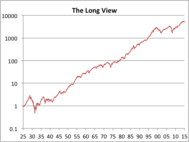
This is what $1 looks like if it were invested in the stock market over the last 90 years. The graph is logarithmic.
One dollar in December 1925 became $5,390 by December 2015. Annualized, that works out to 10.02%. That includes dividends.
Over that time, inflation has run at an annualized rate of 2.91%.
In real terms, the stock market has averaged a real return of 6.90%.
That means the market has doubled, in real terms, on average, every 10.4 years.
Today is September 6 which has historically been the worst time of the year to invest. Let me back up and say that this is based on 120 years of the Dow so using that advice for one particular year is not a good idea.
The bad luck stretches from September 6 to October 29, a total of 53 days. Over that time period, the Dow has lost 2.31%. Of course, that’s not much of a move, but in 120-year averages, that’s a lot. The Dow’s average annual gain is 7.3% so you can see how that 53-day loss cuts into the long-term average.
Why has this pattern existed? I think there’s probably a natural reaction to take back some of the gains accrued over the summer. The data has also been impacted by extreme years such as 1929 and 1987.
Here’s what the Dow’s average year looks like. I smushed 120 years’ worth of data into one year and set it to 100 on January 1.
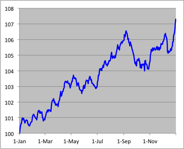
To be clear, I don’t invest based on these seasonal effects. I merely think they’re interesting for their own sake.
 Eddy Elfenbein is a Washington, DC-based speaker, portfolio manager and editor of the blog Crossing Wall Street. His