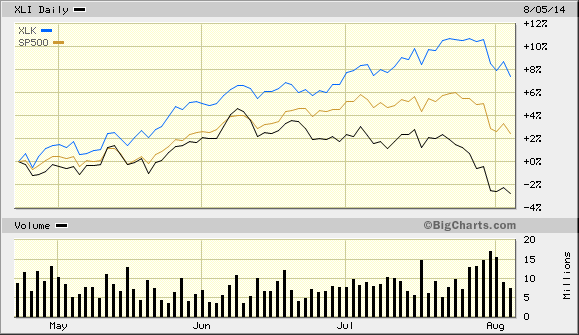
I thought this was interesting. Over the past few months, the Tech sector has started to lead the market while the Industrials have lagged.
I was playing around with some GDP data and came up with this chart. This shows U.S. Real GDP divided by a trendline growing at 3.2%.
In short, when the line is rising, that means that the U.S. economy grew faster than 3.2%. When it’s falling, it grew slower than 3.2%.
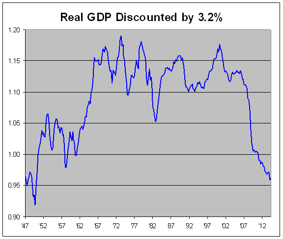
It’s hard to see a precise trend in this data, but it appears to vaguely form an arc. The economy grew very strongly from 1949 to 1966. Over the next 40 years, growth trended at 3.2% (with some notable dips). Since then, growth has been far below the trend.
Regular readers know that I’m a big fan of FRED, the St. Louis Federal Reserve’s Economic Data. This database contains huge numbers of economic data series that are easily searchable.
A user can effortlessly transform FRED data into a usable chart, the kind of which you’ve seen many times on this site (for example, see the ISM chart from yesterday). I’m not alone in my admiration of FRED. The Washington Post writes:
Nobel Laureate economist Paul Krugman is a huge FRED fan. Harvard economist Greg Mankiw uses it. Former Fed chairman Ben Bernanke cited it in a textbook. The site Business Insider called it “the most amazing economics Web site in the world.”
“It definitely has a cult following,” said Eddy Elfenbein, a financial analyst in Washington and editor of CrossingWallStreet.com. For him, FRED has emerged as the central hub for finding and sorting through the reams of financial data. He can spend hours looking up trivia such as the historical price of copper in Britain. “It’s addictive,” Elfenbein said.
There are well over 200,000 different series at FRED. A personal favorite is brick production in England and Wales, 1785 to 1815.
Check out the recent performance of the High-Yield bond ETF ($HYG). If you look at the right scale, it’s really not that big of a move, but it’s plenty big compared with the junk bond market’s recent history.
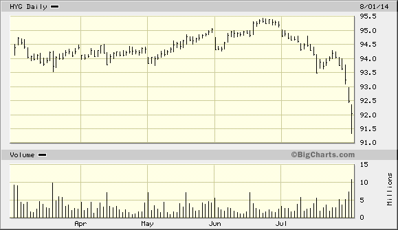
So why are people fleeing junk? I suspect it’s part of a larger pattern where investors are clamoring for safer assets. That’s understandable given the news out of places like Syria, Argentina and Ukraine. What’s also interesting is that Industrial stocks have badly lagged the market over the past two months while Technology has been a leader.
One more news item from Friday. The ISM Index for July came in at 57.1. That’s the highest figure in more than three years.
The ISM came very close to expanding for six months in a row but there was a 0.1 drop from May to June.
On Friday, the government released their first estimate of Q2 GDP growth. They also revised their historical data as well. Here’s a side-by-side look at the old and new numbers.
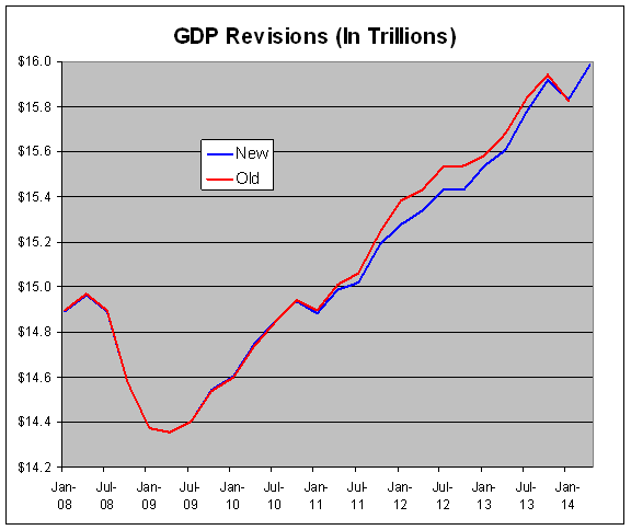
It turns out that the economy did worse during 2011-12 than we originally thought, but the bounce back since then has been better than we thought.
 Eddy Elfenbein is a Washington, DC-based speaker, portfolio manager and editor of the blog Crossing Wall Street. His