-
Could a DISH/DTV Merger Happen?
Posted by Eddy Elfenbein on March 26th, 2014 at 2:13 pmShares of DirecTV ($DTV) are up today on news of a possible merger.
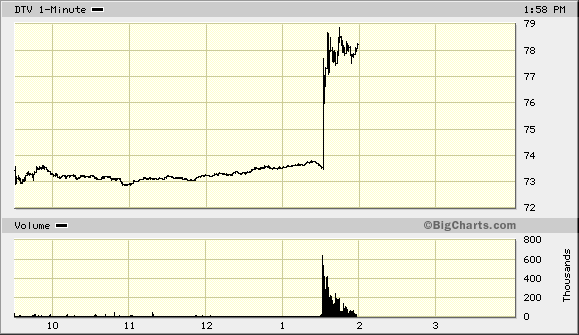
Dish Network Corp. Chairman Charlie Ergen recently contacted DirecTV Chief Executive Officer Mike White to discuss a merger of the two satellite television companies, according to several people with knowledge of the matter. Shares of both companies rose.
Ergen made the approach in response to Comcast Corp.’s $45 billion acquisition of Time Warner Cable Inc. in mid-February, one of the people said, asking not to be identified discussing confidential information. White is reluctant to push forward with formal talks out of concern regulators may block the deal because the two companies directly compete with each other, another person said.
Although White is hesitant to pursue a deal, he hasn’t ruled it out entirely, one person said. The talks are being conducted at a senior level with no official process yet under way, several people said.
Can you tell when the news broke? If you look real hard you might be able to see it.
-
Markets Edge Higher on Durable Goods
Posted by Eddy Elfenbein on March 26th, 2014 at 11:31 amThe stock market regained its footing somewhat this morning. Most of the headlines are focused on the poor IPO of King Digital Entertainment ($KING). The shares are down about 9% from the underwriting price. I’m not sure why every IPO is expected to soar, but this one certainly isn’t.
Healthcare stocks are doing well today, but that’s after a few rough days for them, particularly biotech names. The Commerce Department said this morning that orders for durable goods rose by 2.2% last month. That’s good news; economists were expecting an increase of just 1.0%. The number for January was revised lower to show a drop of 1.3%.
On our Buy List, Qualcomm ($QCOM) is up over $79 per share which is another 14-year high. Oracle ($ORCL) is also making a run at a new 14-year high. Three weeks ago, ORCL hit an intra-day high of $39.85. Today, it’s been as high as $39.45. I think it will hit $40 soon. IBM ($IBM) has also been strong lately. The shares hit a six-month high yesterday.
In other news, “NYC police remove barricades from Wall Street bull.”
-
Morning News: March 26, 2014
Posted by Eddy Elfenbein on March 26th, 2014 at 6:50 amUkraine Starts Talks With Slovakia for Importing Gas From EU
Lifting U.S. Crude Export Ban Would Help Counter Russia- Oil CEO
British Government to Sell a Big Stake in Lloyds Banking
U.S. Unemployment Seen Below 6% by Year’s End
New York Fed: Large Banks Have Significant Funding Advantage
Bitcoin Currency Use Impeded by IRS Property Treatment
Facebook in $2 Billion Deal for Virtual Reality Company
How Tesla’s Fight With Car Dealers Could Help Decide the Next President
Walgreen Co. to Close 76 Unprofitable Stores
Why Employers Will Stop Offering Health Insurance
Murdoch Makes Big Succession Planning Step With Jobs For Sons
A Likely Heir Is Leaving JPMorgan Chase
Warren Buffett Wants to Make It Easier For You to Win His Billion Collars
Credit Writedowns: More Thoughts About Potential for QE from the ECB
Jeff Carter: What Will Wearables Look Like? Will We Even Wear Them?
Be sure to follow me on Twitter.
-
The Shift to Value Continues
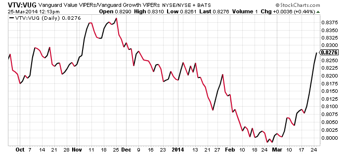
Posted by Eddy Elfenbein on March 25th, 2014 at 12:19 pmOver the last month, the stock market has strongly shifted away from growth stocks and towards value stocks. You can see that most prominently in the drop in Biotech stocks.
Here’s a look at the Vanguard Value ETF ($VTV) divided by the Vanguard Growth ETF ($VUG):
-
Breaking Down the Yield Curve
Posted by Eddy Elfenbein on March 25th, 2014 at 8:34 amThe Treasury yield curve is one of the more important animals in finance. It tells us how much each Treasury bill, note or bond yields across the maturity spectrum.
For the most part, a steep yield curve is bullish for the economy and stock market. A flat or inverted yield curve has often preceded rough times. The yield curve is one of the few forward indicators that has a good track record of predicting what will come.
The yield curve also gives us a glimpse into the future. For example, if we look at the yields on the one- and two-year Treasury, we can work out the math to see what the market believes a one-year Treasury will yield one year from today.
Warning, math ahead. The one-year currently yields 0.14% and the two-year goes for 0.47%. So if you were to get a yield of 0.14% for the next year, you would need to yield 0.80% for the following year to make a two-year yield of 0.47%. Think of it as the market’s opinion for what the market will say in the future.
Here’s the interesting part—every yield curve has in it an implied direction for short-term interest rates. The exact same information in any yield curve can be expressed in the expected direction of short-term rates. For example, we can take the two-year Treasury and compare it with the two-and-a-quarter-year Treasury, and see where the market thinks three-month bills will be two years from now. The steeper the curve, the more rapidly rates are expected to rise.
Check out the chart I made below. The red dots are the current Treasuries at yesterday’s close. I added the blue line in an attempt to smooth out the trend of the red dots. The black line is the implied three-month T-bill based off the blue line.
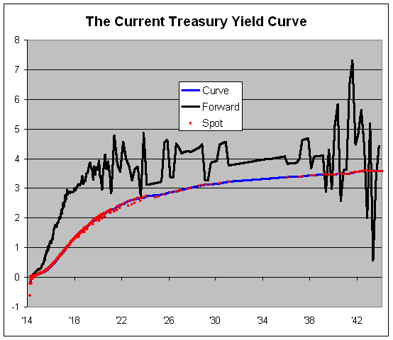
I have to add that the black line looks a little screwy after about five years out. Don’t worry about that part of the graph. The problem is that any small deviation in those long-dated bonds can have a big impact on the implied short-term rate.
The interesting part is what’s expected over the next five years. The bond market’s view is largely inline with the Fed’s most recent guidance. In fact, the bond market is a bit more hawkish than the Fed. The bond market sees rates rising next year and hitting 1% before the year is out. After that, rates are expected to rise continually until the middle of 2017 when they’ll be near 3%.
Janet Yellen’s comments last week caused that rise in the black line, from 0% to 3%, to move to the left by two months.
(My pal, David Merkel, has made these types of graphs before, I believe, with a smoothing function.)
-
Morning News: March 25, 2014
Posted by Eddy Elfenbein on March 25th, 2014 at 7:35 amPutin Threatened With More Sanctions as Russia Out of G-8
Punishing Putin Fuels Energy-Export Drive in Congress
German Business Confidence Slips on Ukraine Tension
UK Inflation Hits New 4-year Low in February, House Prices Up Sharply
EasyJet Leads the Way as Positive Company News Pushes FTSE 1% Higher
With Start-Ups, Greeks Make Recovery Their Own Business
Harbin Bank Said Planning to Price $1.1 Billion IPO Near Low End
Treasury 5-to-30-Year Yield Curve Least Since 2009 on Rates View
Payday-Lending Rules Near as U.S. Agency Sees Debt Traps
Disney Buys YouTube Network Maker Studios for $500 Million
Internet Company Mega Plans New Zealand Listing
Morgan Stanley Investors Await Fed’s Buyback Blessing
Jury Says 5 Madoff Employees Knowingly Aided Swindle of Clients’ Billions
Joshua Brown: Moooooooooo! The Ag Trade is Back!
Cullen Roche: Economists Already Understood the Money Multiplier (not)
Be sure to follow me on Twitter.
-
This One Weird Chart Explains the Entire Market
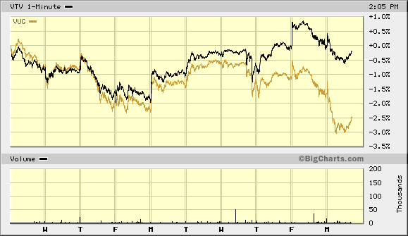
Posted by Eddy Elfenbein on March 24th, 2014 at 2:27 pmHere’s a quick one but it explains a lot. This is the Value ETF ($VTV) along with the Growth ETF ($VUG). They had been behaving similarly until late last week. Since then, a wide gulf has opened as Value has strongly beaten Growth.
-
Investing By Day of the Month
Posted by Eddy Elfenbein on March 24th, 2014 at 1:59 pmIs there a monthly pattern to the stock market?
To find out, I took the entire history of the Dow — all 32,000 data points — and broke down how the Dow has performed by each day of the month. Here are my results:
Day of the Month Count Gain/Loss 1 983 0.153% 2 1032 0.149% 3 1045 0.092% 4 965 0.045% 5 1035 0.069% 6 1062 0.096% 7 1057 -0.053% 8 1084 -0.027% 9 1085 -0.062% 10 1083 0.016% 11 1065 0.023% 12 999 -0.085% 13 1071 0.015% 14 1081 0.026% 15 1086 0.036% 16 1081 0.068% 17 1083 0.037% 18 1081 -0.024% 19 1078 -0.081% 20 1084 0.015% 21 1071 -0.026% 22 1023 -0.040% 23 1065 -0.031% 24 1057 0.009% 25 972 -0.058% 26 1044 0.039% 27 1068 0.005% 28 1059 0.017% 29 1001 0.040% 30 918 0.082% 31 605 0.080% The best days are clustered around the beginning and end of each month. Here’s what the table above looks like in graph form:
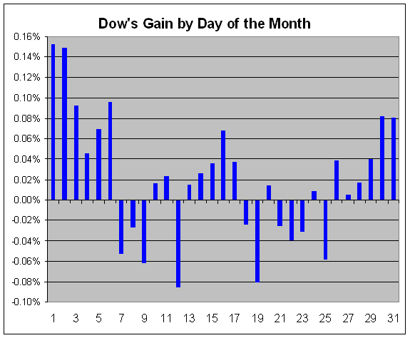
Here’s what the performance looks like.
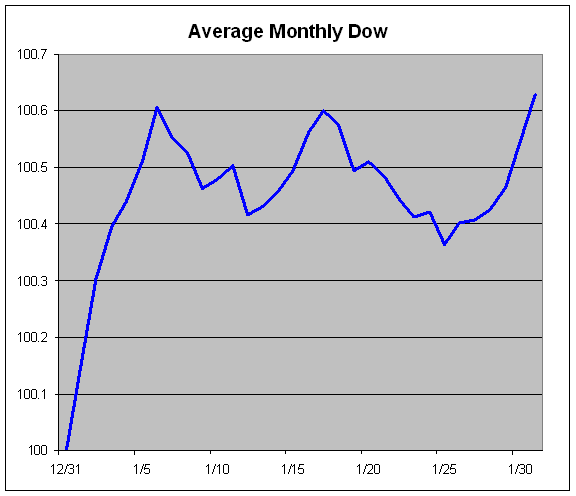
Note that this isn’t literally what the Dow’s average month looks like because the market isn’t open every single day. This is merely a representation of what the cumulative gain looks like based on each day’s average gain or loss.
We can see that the turn of the month is quite good, but the middle of the month sags.
The Biotech Plunge
Posted by Eddy Elfenbein on March 24th, 2014 at 1:43 pmBiotech stocks had a massive rally at the start of this year. In fact, biotechs had been outpacing the market for a long time — that is, until last Friday.
The Biotech ETF ($IBB) broke sharply on Friday and the selling continues today.
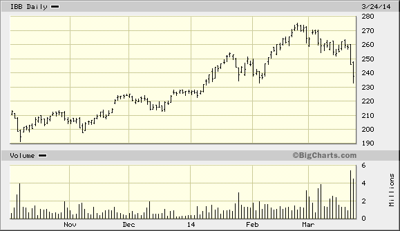
This could be the start in a bear market for “high beta” names. There’s even talk of the new Fab Five — Netflix ($NFLX), Facebook ($FB), Tesla ($TSLA), Priceline ($PCLN) and Google ($GOOG) — all of whom are getting nailed today.
How to Invest $50,000 Right Now
Posted by Eddy Elfenbein on March 24th, 2014 at 12:02 pmI’m often asked how someone can build a portfolio from my Buy List. I’ve purposely built the Buy List so it’s both easy-to-follow and scalable, meaning it works for portfolios large and small.
No, you don’t need to buy all 20 stocks to have a well-rounded portfolio, but it’s great if you can. At minimum, eight stocks are enough for some basic diversification.
I wanted to give you an example of how to build a solid portfolio based on my Buy List. Please keep in mind that the following is just an example; it’s not investment advice. I want people to get the principles behind how I built this rather than the exact specifics of the portfolio.
 Eddy Elfenbein is a Washington, DC-based speaker, portfolio manager and editor of the blog Crossing Wall Street. His